
Most bug reports fail before anyone reads them, not because the bug is hard to fix, but because the report doesn't contain enough information to find it. "The checkout page is broken" is technically a bug report; it's also useless, because whoever picks it up now has to reproduce the exact conditions, guess which element, and figure out what "broken" even means before they can write a single line of a fix. A good bug report template exists to front-load that work onto the person who found the bug, since they're the one who already knows the answer.
What a good bug report actually contains
Six fields cover almost every website bug worth filing:
- URL. The exact page, not "the pricing page" if there are three variants behind a feature flag.
- Selector or element description. Which specific element, ideally a CSS selector, at minimum a precise visual description ("the second CTA button in the hero, not the nav one").
- Viewport / device. Desktop, tablet, or a specific phone width, since a huge share of website bugs only reproduce at certain breakpoints.
- Expected vs. actual behavior. Two sentences, not one paragraph of narrative. "Expected: form submits and shows a success message. Actual: form submits but nothing visible changes."
- Repro steps. The minimum sequence of clicks that reliably triggers it, numbered, not described in prose.
- Console output. Any error, warning, or network failure visible in dev tools at the time, this alone often points straight at the cause.
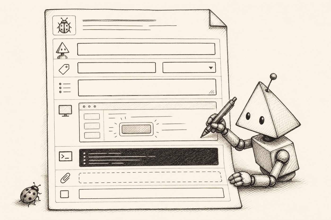
The copy-paste template
## Bug: [short, specific title]

**URL:**
**Element / selector:**
**Viewport:** [e.g. 375px mobile / 1440px desktop]
**Severity:** [blocker / major / minor / cosmetic]

**Expected:**


**Actual:**


**Steps to reproduce:**
1.
2.
3.

**Console output:** [paste any errors, warnings, or failed network requests here]

**Screenshot / recording:**
Fill in every field, even the ones that feel obvious. "Console output: none" is still useful information, it rules out a JS error as the cause and points the person fixing it somewhere else faster.
The one field most templates skip: severity
Notice the template above adds a severity line the six-field list doesn't strictly require. It's worth the extra second because it's what turns a flat list of bugs into a queue someone can actually work in priority order. A shared, four-level scale keeps everyone honest about what "urgent" means:
| Severity | Roughly means | Example |
|---|---|---|
| Blocker | Core flow is unusable; ship-stopper | Checkout button does nothing; nobody can pay |
| Major | Important feature broken, but a path around it exists | Signup fails on mobile Safari only |
| Minor | Works, but wrong or confusing | Success toast shows for half a second, easy to miss |
| Cosmetic | Visual only, no functional impact | Footer icons misaligned by a few pixels |
Without a severity field, everything arrives implicitly labeled "please fix," and the person triaging has to reconstruct priority from the wording, which is exactly the kind of guesswork a template is supposed to eliminate.
A filled-in example
Here's what the template looks like with real information in every field, the kind of report that gets picked up and fixed without a single clarifying question:
## Bug: Newsletter signup shows no confirmation after submit

**URL:** getshotline.com/blog
**Element / selector:** form#newsletter-signup button[type="submit"]
**Viewport:** 1440px desktop (also reproduces at 375px mobile)
**Severity:** Major

**Expected:**
After clicking Subscribe, a success message should replace the form or
appear above it.

**Actual:**
Button shows a brief loading spinner, then reverts to its normal state.
No success or error message ever appears. Network tab confirms the POST
to /api/subscribe returns 200.

**Steps to reproduce:**
1. Go to /blog
2. Scroll to the newsletter form at the bottom of the page
3. Enter any valid email and click Subscribe

**Console output:** Warning: Cannot update state on an unmounted
component (React), fired immediately after the POST resolves.

**Screenshot / recording:** [attached]
Notice that the console warning alone strongly suggests the actual cause, a state update firing after a component has already unmounted or re-rendered, which is a lead a developer or an agent can go investigate directly instead of starting from "something's wrong with the form."
Why "the button looks weird" isn't a bug report
A report missing the selector, viewport, or repro steps doesn't fail because the writer was lazy, it fails because the format doesn't force the information out of them. Someone genuinely trying to be helpful will still write "the pricing table looks off on mobile" if nothing prompts them for the width, the specific row, or a screenshot. The template above works precisely because it makes the vague version harder to write than the specific one, seven labeled blanks are a stronger nudge toward specificity than an open text box ever is.
This matters more once an AI coding agent is the one picking up the report instead of a person. An agent can act directly on a URL, a selector, and a console error, it has nothing to work with from "the button looks weird" beyond making a guess and asking you to confirm it, which turns a one-shot fix into a multi-round back-and-forth. The same principle drives everything in our website QA checklist: specificity up front saves rounds of clarification later, whether the person closing the loop is human or automated. It's also the exact vague-versus-specific split walked through, comment by comment, in website feedback examples.
The parts of this template that used to require manual work
Filling in a URL and expected-vs-actual is quick. Getting the exact CSS selector, the precise viewport, and a clean console capture is where most bug reports quietly get shortened, because doing it properly means opening dev tools, right-clicking to inspect, copying a selector, checking the console tab, and pasting all of it into a form, several extra steps most people skip under time pressure, which is exactly why so many reports arrive as "the button looks weird" instead of the full version above.
This is the specific gap a pin-based feedback tool closes: click the broken element on the live page, and the selector, viewport, and any console errors at that moment are captured automatically, the same fields the template asks for, filled in without anyone opening dev tools by hand. Whoever's reading the report (or whichever agent is queued to act on it) gets the structured version every time, not whatever fraction of the fields the reporter remembered to fill in. Before trusting an auto-captured selector against your actual markup, the CSS selector tester is a fast way to double-check it matches exactly one element and nothing else.
Where these reports should actually live
A template only helps if reports end up somewhere a developer (or an agent) checks regularly, not scattered across a Slack channel, an email thread, and whatever ticketing tool a client happened to have open that day. Three practical rules keep a bug queue usable instead of just accumulating:
- One place, not three. Splitting reports across Slack, email, and a ticket tracker guarantees some get missed. Pick one queue and route everything through it, even a quick Slack message someone flags gets copied into the same place.
- A visible state per item, not just a growing list. Open, in progress, fixed, needs more info, four states cover almost every bug's actual lifecycle, and a report with no state is functionally invisible after the first day.
- The report stays attached to the fix. When something's marked fixed, the original repro steps and console output should still be there, so if it regresses later, nobody has to reconstruct the original report from memory.

Using this template with a coding agent
If you're running Claude Code, Cursor, or Codex to fix reported bugs, paste the filled-in template directly into your prompt. The selector and console output in particular give the agent something concrete to act on instead of a description it has to interpret, "find the element matching this selector, in this file, and fix this specific console error" is a task an agent can execute correctly on the first pass far more often than "the button looks weird." We cover why a plain screenshot doesn't give an agent enough to work with, and what does, in stop screenshotting your site into Claude.
Where Shotline fits
Shotline auto-captures four of the six core template fields the moment someone pins feedback on a live page: URL, selector, viewport, and any console output at that moment, no dev tools required from the person reporting it. The remaining fields, expected-vs-actual, repro steps, and a severity label, stay a short written note, which is a much smaller ask than filling in the whole template by hand. It's exposed over MCP so a coding agent can pull the structured version directly and ship a fix with before/after proof attached, rather than a person re-typing a bug report into a prompt from scratch. Free to try for 14 days, no card required, then from $19/mo (billed annually; $25 month-to-month). If your bug reports keep arriving without the details in this template, start a free trial and see the difference a pinned element makes on the next one.