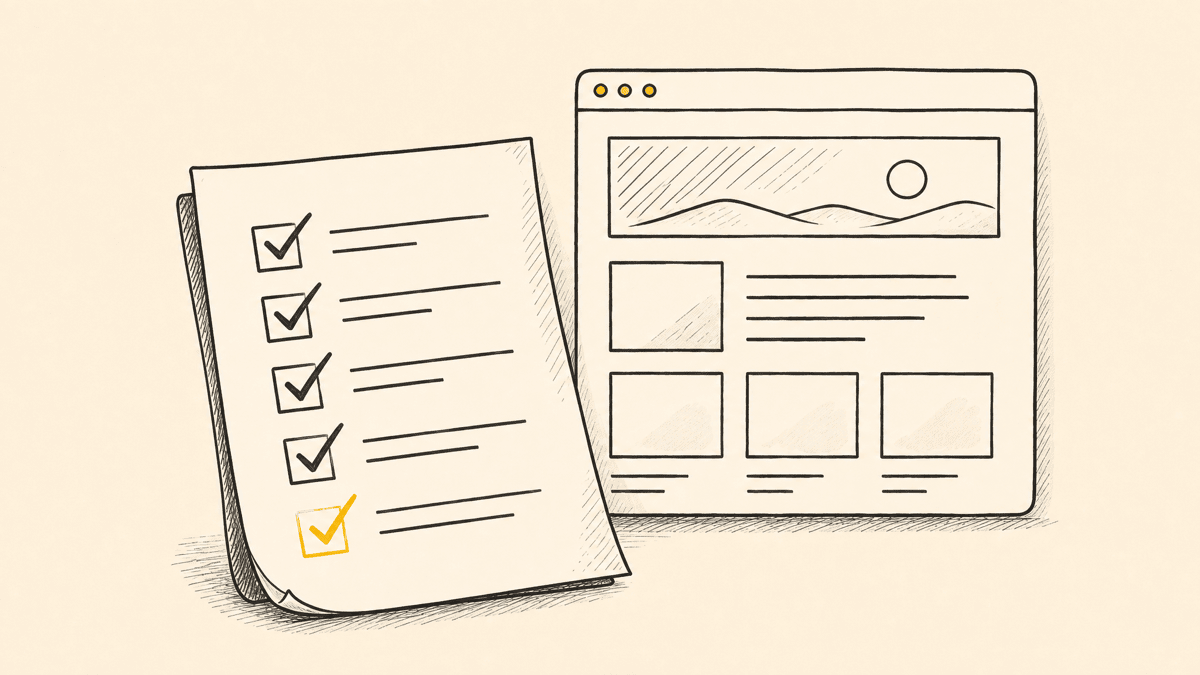
Every launch has a version of this story: the site looks done, everyone signs off, and three hours after it goes live someone finds a broken contact form, or a nav link that 404s, or a hero image that never loads on mobile. A website QA checklist exists to catch that stuff before your users do, and the good ones aren't clever, they're just complete. This is the checklist we actually run before shipping, organized by the seven places bugs hide.
Treat this as a working document, not a formality. Copy it into your launch ticket, check items off as you go, and don't ship with a red row still open.
Before you start: scope the pass
Decide what "done" means before you start clicking around. A marketing site launch and an app redeploy need different depth, but both need someone to actually look at the rendered page, not just confirm the build succeeded. A green CI run tells you the code compiles. It says nothing about whether the pricing table wraps weirdly at 1024px or whether a form's success state is invisible on a dark background. That's the gap this checklist closes.
1. Responsive and cross-device
- Load every template (home, a listing page, a form page, a 404) at phone, tablet, and desktop widths, not just the three breakpoints your CSS framework ships with.
- Check the 320–375px range specifically. Most layouts survive 768px and up; a lot break at the narrowest phones.
- Confirm nothing overflows horizontally. A single element wider than its container silently breaks scroll on mobile and is easy to miss on desktop.
- Test at least one real device per platform, not just a resized browser window. Emulators miss real touch-target sizing and font-rendering differences.
2. Links and navigation
- Click every link in the primary nav, the footer, and any in-content CTAs. A crawler catches dead links faster than clicking manually, but a manual pass catches links that resolve to the wrong page, which a crawler won't flag.
- Check that external links open sensibly (new tab where it matters, not everywhere by default) and don't leak a referrer you didn't intend to send.
- Confirm redirects from old URLs are in place if this is a redesign, not a fresh site. A launch that silently 404s every inbound link from search results and old bookmarks is one of the most common self-inflicted traffic drops.
- Verify breadcrumbs and back buttons land where a user expects, especially after a filter or search interaction.
3. Meta and SEO basics
- Every page has a unique title and meta description, not a template default repeated across twenty URLs.
- Canonical tags point to the right URL, especially on pages reachable through multiple paths (trailing slash, query params,
wwwvs. bare domain). - The sitemap is current and actually submitted, and
robots.txtisn't accidentally blocking the whole site, which happens more often than it should on a fresh deploy. - Open Graph tags are set and the preview image actually renders, on every major template, not just the homepage.
4. Accessibility and contrast
- Every interactive element is reachable and operable by keyboard alone, tab through the page and confirm focus is visible at every stop.
- Images that carry meaning have real alt text; decorative images have empty alt text, not a filename.
- Text and background color pairs pass WCAG AA at minimum, run each pairing through a contrast checker rather than eyeballing it, since a color that reads as "clearly readable" to a designer's calibrated monitor can still fail the ratio. (AA means a 4.5:1 ratio for normal text, 3:1 for large text.)
- Form fields have associated labels, not just placeholder text that vanishes the moment someone starts typing.
The standard to aim at is WCAG 2.2 Level AA, which has been the definitive version since October 5, 2023 and is what accessibility law now references in practice — the European Accessibility Act (in force since June 2025), the EN 301 549 standard, and updated Section 508 guidance all point at WCAG 2.2 AA. This isn't just a compliance box: the nine success criteria WCAG 2.2 added over 2.1 (things like visible focus not being obscured, and dragging movements having a single-pointer alternative) are exactly the kind of thing that breaks quietly for real users on a fresh build.
5. Forms and interactions
- Submit every form with valid data and confirm the success state is actually visible, not just present in the DOM behind something else.
- Submit every form with invalid data and confirm the error messages are specific enough to act on, not a generic "something went wrong."
- Test what happens on a slow connection: does a double-click on submit fire the request twice? Is there a loading state, or does the button just sit there looking clickable?
- Check that required-field validation matches what's actually required server-side. A mismatch here is a classic source of silent lost leads.
6. Performance and console errors
- Open the browser console on every template and confirm it's clean. A page that "works" while throwing five errors on load is a page one dependency update away from actually breaking.
- Check that images are sized and compressed appropriately, an uncompressed hero image is still the single most common performance regression on a fresh launch.
- Run a Lighthouse or equivalent pass and look specifically at layout shift, a page that visually jumps as it loads reads as broken even when every asset technically arrives.
- Confirm analytics and any conversion tracking actually fire, checking after launch is too late to catch a silently broken pixel.
It's worth checking against real numbers rather than a vague sense of "fast enough." Google's Core Web Vitals set three concrete thresholds for a "good" page: Largest Contentful Paint (LCP) under 2.5 seconds, Interaction to Next Paint (INP) under 200 ms, and Cumulative Layout Shift (CLS) under 0.1. INP is the one to actually re-test in 2026 — it replaced First Input Delay as the official responsiveness metric in March 2024, and it's stricter, because it measures every interaction on the page, not just the first. And these are field metrics: in Search Console, a URL group only earns a "good" rating when at least 75% of real visits clear all three thresholds, so a lab score of 100 on your own fast laptop isn't the same as passing.
7. Content and final pass
- Read every page top to bottom for typos and placeholder text. "Lorem ipsum" and
[insert client name]surviving to production is rarer than you'd think, until it happens to you. - Confirm dates, prices, and any dynamic content are current, not frozen from whenever the template was built.
- Check that the favicon, page title in the browser tab, and social share preview all match the brand, small details that are disproportionately visible to anyone who bookmarks or shares the page.
| Category | What breaks most often | Fastest way to check |
|---|---|---|
| Responsive | Overflow at narrow widths, hidden content on tablet | Resize + a real phone |
| Links | Dead internal links after a redesign | Click-through pass or a crawler |
| Meta / SEO | Duplicate titles, blocked robots.txt | View source per template |
| Accessibility | Low-contrast text, missing labels | Contrast checker |
| Forms | Invisible success state, duplicate submits | Submit with real and bad data |
| Performance | Console errors, uncompressed images | DevTools + Lighthouse |
| Content | Placeholder text, stale dates | Full read-through |

Turning findings into fixes someone can act on
The checklist finds problems; what happens next is where most QA passes actually fall apart. "The pricing table looks off on mobile" isn't a bug report, it's a feeling. Whoever fixes it still has to find the right page, the right breakpoint, and the right element before they can do anything. That translation step is where a lot of QA time quietly disappears.
The fastest way we've found to close that gap is to stop describing the problem and instead pin it: drop a marker directly on the live element at the width where it's broken, and let whoever (or whatever) fixes it start from the actual DOM node and selector instead of a paragraph of description. If you're running this checklist with a client or a teammate who isn't going to write a formal bug report, that's doubly true, a pin on the page is something anyone can leave without training. We cover the different ways teams collect that kind of feedback, forms, widgets, and pins, in how to collect feedback on a website, and the same pin-precision logic applies to open-ended design notes, not just QA, which we get into in website design feedback.
Make it a habit, not a one-time pass
The checklist above is meant to run before every launch, not just the first one. Redesigns, new templates, and third-party script updates all reintroduce the same categories of bugs, so the cheapest time to catch them is the same pre-launch pass, every time, not a postmortem after a client notices first.
If you want the whole category of feedback and QA tools compared honestly, start with the best website feedback tools. Shotline is built to sit at the end of a QA pass like this one: drop a pin on anything from the checklist above, straight on the live page, and it carries the selector, viewport, and console context to whoever fixes it, whether that's a person or a coding agent working the queue. It's free to try for 14 days, no card required, then from $19/mo (billed annually; $25 month-to-month). Start a QA pass on your own site at the Shotline homepage.