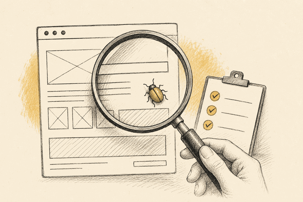
QA testing, quality assurance testing, is the practice of checking that a piece of software actually does what it's supposed to do before real users find out the hard way. For a web team, that spans a wider range than the phrase usually suggests: it's not just "does the code run without crashing," it's "does the page render correctly, is it usable, is it accessible, does the checkout flow actually complete." Most of what breaks a website launch isn't a crash, it's something that technically works but is visibly, specifically wrong.
This is a practical walkthrough of what QA testing actually covers for people shipping websites, not a software-engineering theory piece.
Why QA is worth the time: the cost curve
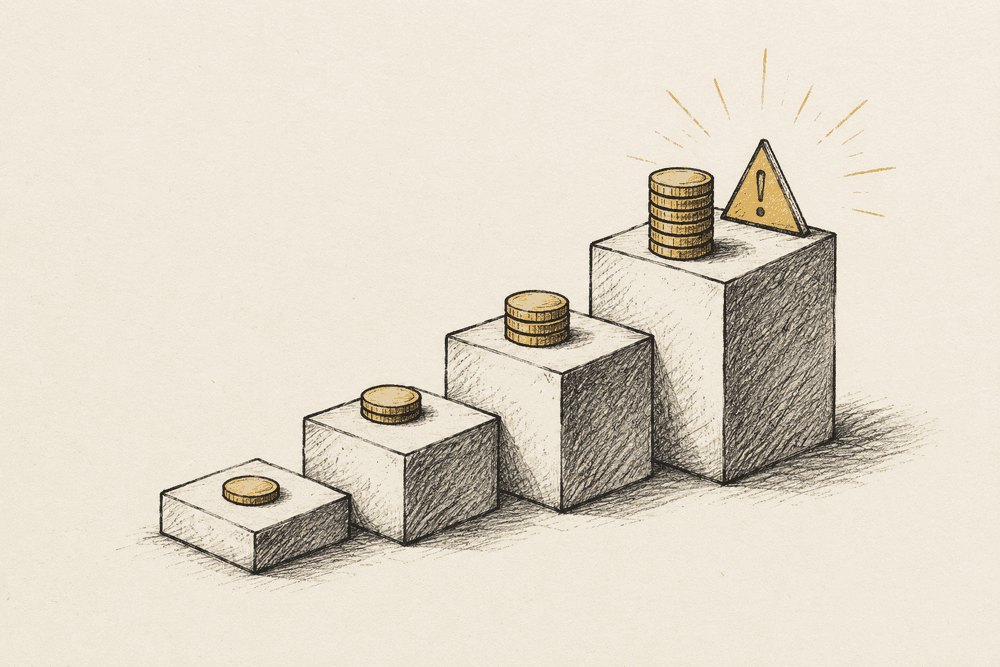
The case for QA isn't abstract diligence, it's a measurable cost curve. The same defect gets more expensive to fix the later it's caught, and the multipliers are steep: 2026 defect-cost data puts a bug caught in development at roughly 1x, the same bug caught in staging at around 10x, and in production at about 100x. Zoom out and the aggregate is staggering, the Consortium for Information and Software Quality estimates poor software quality costs the US economy around $2.41 trillion a year. QA is the cheap end of that curve.
There's a user-facing number too, and it's the one that matters most for a website: roughly 68% of users abandon an application after encountering just two bugs. You rarely get a third strike. That's why the goal of a QA pass isn't "zero defects ever," which is unattainable, but a low escape rate, the share of bugs that reach production instead of getting caught first. A useful starting target for a small web team is under a 10% escape rate, with mature teams pushing below 5%. You can't manage that without a QA pass structured enough to measure against.
The core distinction: QA vs. just "testing"
"Testing" often gets used narrowly, unit tests, integration tests, the kind of automated checks that run in CI and confirm a function returns the right value. QA is broader than that. Quality assurance is the whole discipline of preventing defects from reaching users, and automated tests are one tool inside it, not the whole job. A page can pass every unit test in the suite and still ship with a color contrast failure, a form that's impossible to complete on a phone, or a button that's technically clickable but three pixels wide on a specific breakpoint. None of that shows up in a green CI run. All of it shows up the first time a real person tries to use the page.
The categories that matter for a website
Functional QA checks that features work as intended: forms submit, links go to the right place, a checkout flow completes end to end, a filter actually filters. This is the closest to what "testing" usually means and the most likely to already have some coverage.
Visual QA checks that the page looks right, not just that it works. Overlapping elements, broken responsive layouts, images that fail to load, text that's unreadable against its background. This is the category that automated test suites are worst at catching, because "looks wrong" is a judgment call a script can't easily make, and it's the category that ends up in a client's inbox first if it slips through.
Accessibility QA checks that the page works for people using assistive technology or navigating without a mouse: keyboard-only navigation, screen reader labels, color contrast that meets WCAG thresholds. This overlaps with visual QA but deserves its own pass, since a page can look fine to a sighted user with a mouse and still be functionally broken for someone who isn't.
Cross-browser and cross-device QA checks that all of the above holds up outside whatever browser and screen size the team happens to develop on. A layout that's perfect in Chrome on a 27-inch monitor can break in ways nobody on the team would ever see without deliberately checking a 375px viewport.
Regression QA checks that a new change didn't quietly break something that used to work. This is the category most teams skip under deadline pressure, and the one most likely to produce the "it worked yesterday" bug report.
Manual vs. automated: where each one earns its keep
Automated tests are fast, repeatable, and excellent at catching the same class of bug over and over without human attention, a broken build, a function returning the wrong value, a route that 404s. They're much weaker at anything subjective: whether a layout "looks broken," whether a color choice is actually readable, whether a flow that technically works is confusing to a first-time user.
Manual QA, a human actually looking at the rendered page, is slower and doesn't scale the same way, but it catches the class of bug automated tests structurally can't: anything that requires judgment about how something looks or feels rather than whether a value matches an expected output. The practical answer for most web teams isn't picking one, it's automating the mechanical checks (links resolve, forms submit, no console errors) and reserving human attention for the visual and experiential pass that actually needs eyes on the page.
Accessibility contrast: a concrete example
Color contrast is a good example of a check that's simple in principle and easy to get wrong in practice. WCAG AA requires a contrast ratio of at least 4.5:1 for normal text and 3:1 for large text against its background. A color pairing can look perfectly readable on a bright, well-calibrated monitor and still fail that ratio, which is why "it looks fine to me" isn't a reliable QA method here. Running the actual pairing through a contrast checker takes a few seconds and removes the guesswork, and it's cheap enough to run on every text-and-background pair on a page rather than spot-checking the obvious ones.
Building a QA pass that actually fits in a launch timeline
The mistake most teams make with QA is treating it as a single undifferentiated task at the end of a project, "test the site," with no structure for what that means. A QA pass works better broken into the categories above, each with its own quick checklist, so it's something a team can actually run through systematically instead of clicking around hoping to notice what's wrong. We cover the full version of this, organized by the specific places bugs hide, in the website QA checklist, which is the practical companion to this post.
Turning a QA finding into a fix someone can act on
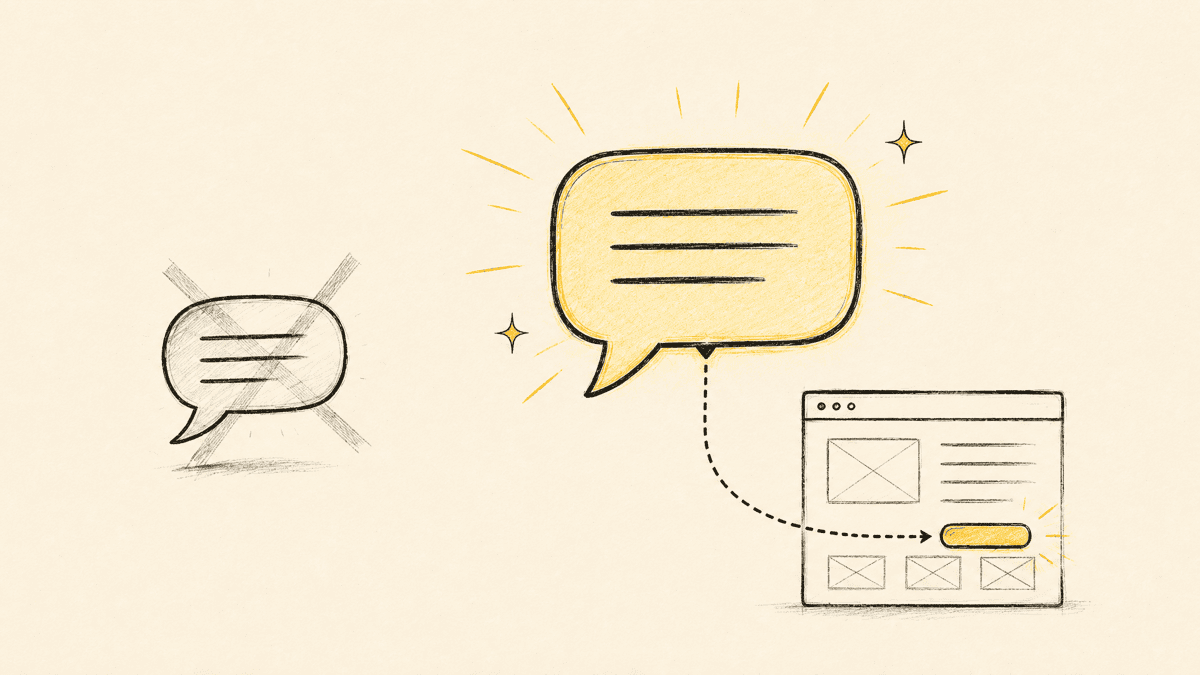
Finding a bug and reporting it well are two different skills, and the gap between them is where a lot of QA time quietly evaporates. "The pricing table looks broken on mobile" is a finding, not a bug report, whoever fixes it still has to reproduce it, find the right breakpoint, and locate the actual element before doing anything. A good bug report closes that gap up front: the URL, the exact element or selector, the viewport it happened at, and ideally a screenshot. We break down what a genuinely useful bug report contains, and a template for writing them consistently, in the bug report template.
QA as a habit, not a milestone
The categories above aren't a one-time pre-launch ritual, they're a set of checks worth running on every meaningful change, not just the big launch. A redesign, a new template, even a copy update on a high-traffic page all reintroduce the same categories of risk. Teams that treat QA as a habit built into every release catch far more before it ships than teams that only run a full pass once, right before a deadline, when there's the least time to actually fix what turns up. One specific item worth building into that habit is the social share preview, an invisible-until-shared detail covered in the right OG image size, which breaks silently exactly the way regression bugs do.
Where Shotline fits
Visual and accessibility QA both come down to the same underlying need: a fast way to flag something specific on the actual rendered page and hand it to whoever fixes it with enough context to act immediately. Shotline lets anyone on a QA pass, or a client doing a final check, pin a comment directly to the exact element at the exact width where something's wrong, with the selector, viewport, and a screenshot attached automatically. If a coding agent is doing some of the fixing, that same pin is exposed over MCP so it can locate and fix the element without a human re-typing the description first.
Shotline is free to try for 14 days, no card required, then from $19/mo (billed annually; $25 month-to-month) with unlimited seats. Run your next QA pass through it at the Shotline homepage, or start a free trial.