The right OG image size is 1200 by 630 pixels, at a 1.91:1 aspect ratio. That single dimension renders cleanly on every major platform, Facebook, LinkedIn, X, Slack, Discord, so if you only build one share image, build it at 1200x630 and move on. The mistakes that actually break a link preview are almost never about picking the wrong pixel count, they're about the file itself, a missing tag, an oversized file, or text that gets cropped by a platform's specific safe zone. This covers both.
The universal size
1200x630px is the closest thing this space has to a single correct answer. It's wide enough to look sharp at the sizes platforms actually render it, and the 1.91:1 ratio it produces is the shape Facebook's Open Graph spec was built around, which most other platforms have converged on since. Set og:image to a 1200x630 file and every major platform has something reasonable to work with, even the ones with slightly different native preferences.
Platform-by-platform, where it actually differs
| Platform | Recommended size | Notes |
|---|---|---|
| 1200 x 630px (1.91:1) | Minimum that reliably displays is 600 x 315px; anything under 200 x 200px is rejected outright | |
| 1200 x 627px (1.91:1) | Functionally identical to Facebook's spec; one image covers both | |
| X (Twitter) | 1200 x 675px (16:9) for the large card | Small "summary" card uses 800 x 418px; a standard 1200x630 image still renders correctly on the large card |
| Slack / Discord | 1200 x 630px | Both read standard Open Graph tags; no platform-specific override needed |
The practical takeaway from that table: you don't need a different image per platform. One well-made 1200x630 image, saved once, covers the overwhelming majority of places a link gets shared.
File size and format
Keep the file itself well under the platform limits, Facebook and LinkedIn both accept up to 8MB but a share image loading slowly defeats the point of a fast preview, so aim for well under 1MB regardless of the hard ceiling. JPG works fine for photographic images; PNG is worth it when the image has flat color fields, text, or sharp edges that JPG compression tends to smear. Whichever format, compress it before deploying, an uncompressed 1200x630 PNG can easily land at 2-3MB for no visible quality gain over a properly compressed version at a fraction of the size.
The tightest real-world constraint in 2026 isn't Facebook's ceiling, it's WhatsApp. WhatsApp enforces a much stricter budget, roughly 300KB, along with a short fetch timeout, and it's now one of the most common ways a link actually gets shared. An image that's fine for a desktop feed at 900KB can silently fail to generate a preview in a WhatsApp message, showing a bare link instead. Getting your OG image comfortably under ~300KB means it renders everywhere, including the mobile-messaging surfaces that a desktop-only test never checks.

The safe zone: where cropping actually bites
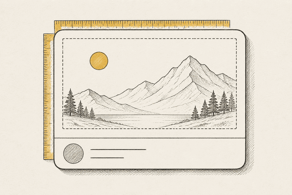
Different platforms crop an OG image slightly differently depending on where it's displayed, a card in a feed versus an expanded link preview versus a chat app bubble. The practical fix is designing to a safe zone rather than assuming the full canvas is always visible: keep any text, logo, or face you need visible inside the center roughly 1080 x 565px of a 1200x630 image, about 60px of margin on each side. Anything critical placed right at the edge of the full canvas is the single most common reason a headline reads as cut off in one platform's preview and fine in another's.
The mistakes that actually break a preview
Most broken OG previews aren't a sizing problem at all, they're one of these:
- Missing or malformed
og:imagetag. The tag exists but points to a relative path instead of an absolute URL, which several platforms' crawlers won't resolve correctly. Always use the fullhttps://URL. - No fallback dimensions declared. Setting
og:image:widthandog:image:heightalongside the image lets platforms render the preview immediately instead of waiting to fetch and measure the image first, which on a slow host can mean the preview shows blank on the first share. - A dynamic image that changes after the first crawl. Several platforms cache the preview aggressively after the first fetch. If you update the OG image later, the old one can keep showing for days until the cache expires or you force a re-scrape through the platform's own debug tool.
- Text that's readable on your monitor but not at feed size. A share card in a mobile feed renders small. Headline text under roughly 40px equivalent in the source image tends to disappear at that display size, even though it reads fine zoomed in during design review.
- No image at all. The most common failure mode by volume: a page with no
og:imagetag falls back to whatever a platform decides to guess, often a random image scraped from the page body, or nothing.
Do you need a different image per page?
Yes, and this is a separate mistake from getting the dimensions wrong: reusing one generic OG image across an entire site, a blog's homepage image on every individual post, for instance, throws away a real opportunity. A share card with a headline or a relevant visual specific to that page gets more clicks than a generic logo card, because it tells the person seeing it in a feed what they're actually about to open. This matters most for content-heavy pages, blog posts, product pages, comparison pages, where a per-page image is worth the setup cost even if a template default is fine for utility pages like a login screen or a settings page.
Building the meta tags correctly
Beyond the image itself, the full head tag set matters, og:image, og:image:width, og:image:height, og:title, and og:description together, plus the Twitter Card equivalents if you want X's large-image card specifically rather than a smaller fallback. Getting all of these right by hand, across every template on a site, is exactly the kind of detail that's easy to get right once and then forget on the next new page type. Our free meta tag generator builds the complete head set, including the Open Graph and Twitter Card tags, from a short form, so nothing gets left out on a new template.
Check your preview before you ship it, not after
The only reliable way to know how a share card actually looks is to render it the way each platform would, not to eyeball the raw image in a folder. Our free Open Graph and social preview checker does exactly that: paste the HTML from a page's <head>, and see how the link will look as a share card on X, Facebook, LinkedIn, and Slack, with missing or malformed tags flagged directly. It's a five-second check that catches most of the mistakes in the list above before a broken preview goes out in an actual share.
This is the same category of pre-launch check we cover more broadly in the website QA checklist, which treats a working social preview as one line item among the several categories worth confirming before any launch, not a one-off task. If you're building the reference set of technical details worth getting right on a page, the same logic that governs OG image cropping and safe zones applies to selecting and styling the elements around it, which our CSS selector cheat sheet covers from the styling side.
Where Shotline fits
A broken share preview is exactly the kind of bug that's invisible in normal browsing and obvious the moment someone actually shares the link, which makes it easy to ship and slow to notice. Shotline lets anyone on a QA pass pin feedback directly to a live page with the selector and viewport attached, so if a template's preview looks wrong once you catch it with the checker above, the fix request carries enough context for a developer or coding agent to act on immediately instead of guessing which template needs the tag added.
Shotline is free to try for 14 days, no card required, then from $19/mo (billed annually; $25 month-to-month). See it on the Shotline homepage or start a free trial.